Hey, I’m RJ from Higher Foundations.
Do you also get stuck when trying to figure out the page designs for a website? Well, that’s why I made this article. Today, I’m going to show you how I create a detailed website layout in Figma with little to no design skills required.
I’ll break down the exact steps I use to turn my page and section plan into a visual layout by grabbing screenshots and dropping them into Figma.
If you haven’t already watched the video on how to make a complete page and section plan, I recommend doing that first, since it’ll make this process way easier.
Let’s get into it.
Step 1: Download, Install, and Log Into Figma
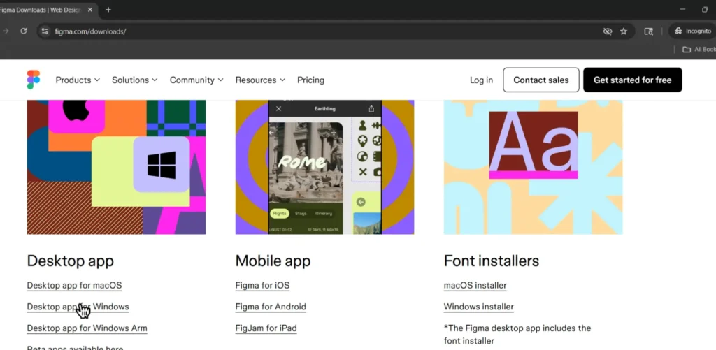
First, we need to install Figma.
Head to your browser and type “Figma download.” Once you’re on the site, choose the desktop app (not mobile, you can’t edit Figma on mobile). If you’re on Windows like me, click Download for Windows, save the file, and let it install.
Once it opens:
- Create an account if you don’t already have one.
- Enter your name, email, and password.
- When prompted to “Open in Desktop App,” click Open.
- Select Starter (Free) to begin, and click Design with Figma.
- Close any pop-up tutorials.
- You should now see a blank Figma screen. That means you’re ready for the next step.
Step 2: Create a Rough Layout Design in Figma
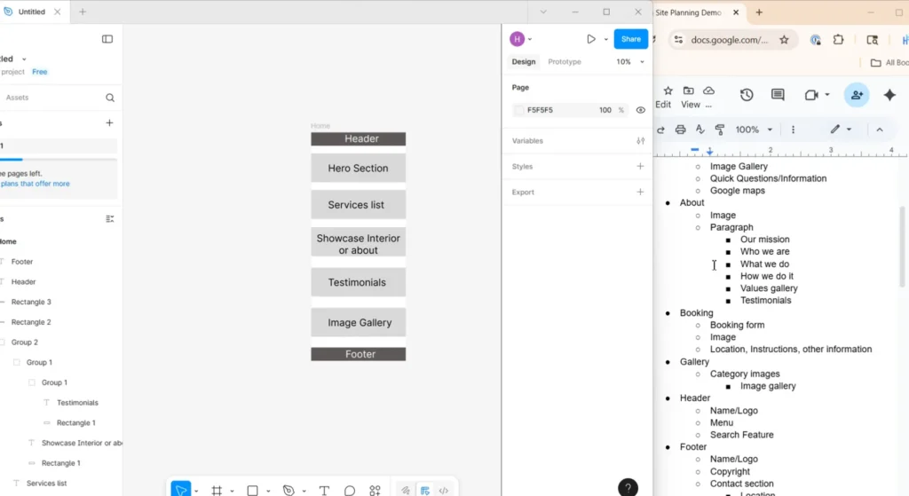
I’ve set up my screen so that Figma is on the left and my Google Doc (with the page and section plan) is on the right. That makes this process faster.
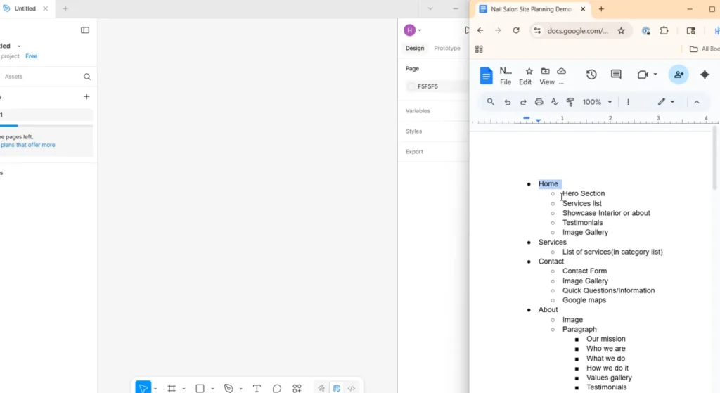
Now, we’re going to take each page and section from that plan and turn it into a rough wireframe.
Here’s how:
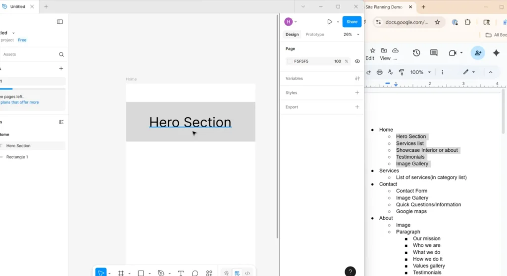
- In Figma, click the Frame Tool (the grid icon).
- Drag out a new frame.
- Set the width to 1440px, this is the average desktop size.
- Name the page (start with “Home”).
- Select the Rectangle Tool from the shape menu and draw your first section block.
- Add a Text Box on top of the rectangle. Change the font size to around 150px and type your first section name (like “Hero Section”).
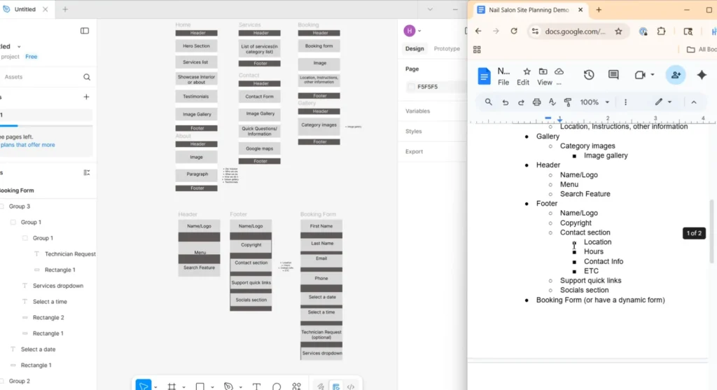
Repeat that process for every section on the page; plus add a header and footer to complete each page layout.
- Create a rectangle at the top for your header and one at the bottom for your footer.
- Make them a darker color so they stand out.
- Add text inside each and label them “Header” and “Footer.”
Once you’ve finished, move on to the next page in your Google Doc. Repeat this process for all of the remaining pages. When you’re done, you’ll have every page’s wireframes set up, and you’re ready for the next step.
Step 3: Insert Screenshots to Create a Detailed Layout Design
Now it’s time to turn this rough layout into a detailed visual plan using real website screenshots.
Everything we’ve done so far, the Google Doc, the section planning, and this wireframe, has been to make this step smooth and organized.
Here’s how to do it:
- Go back to the list of real websites you gathered earlier.
- Open each one and start looking at the sections you listed, beginning with the hero section on the homepage.
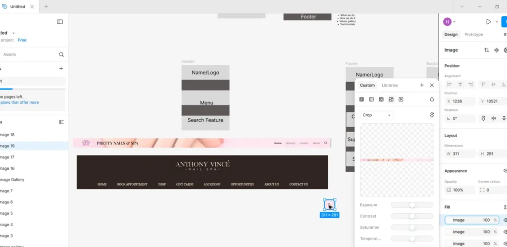
- When you find a design or layout you like, take a screenshot of that section.
- Drag and drop it into your Figma layout in the right place.
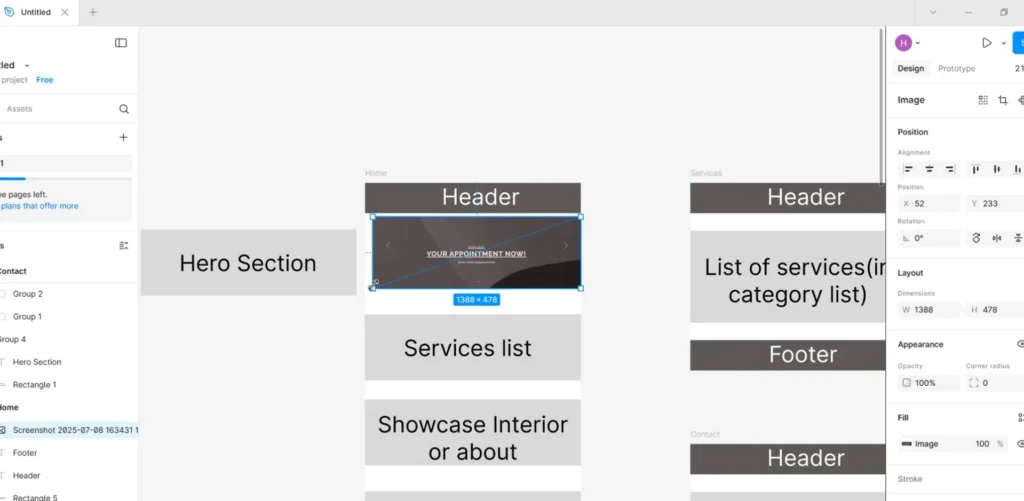
You’ll notice that this instantly makes your layout feel much more complete. You don’t need to overthink the design, just pick what looks good. We all browse websites daily, so we already have an instinct for what looks good and what doesn’t. That’s what makes this strategy work so well; it taps into the natural design sense we have, which means we don’t have to waste time recreating elements that others have already built (you don’t need to reinvent the wheel).
Alright, once you’ve added screenshots for all your page sections, you’re ready to move on.
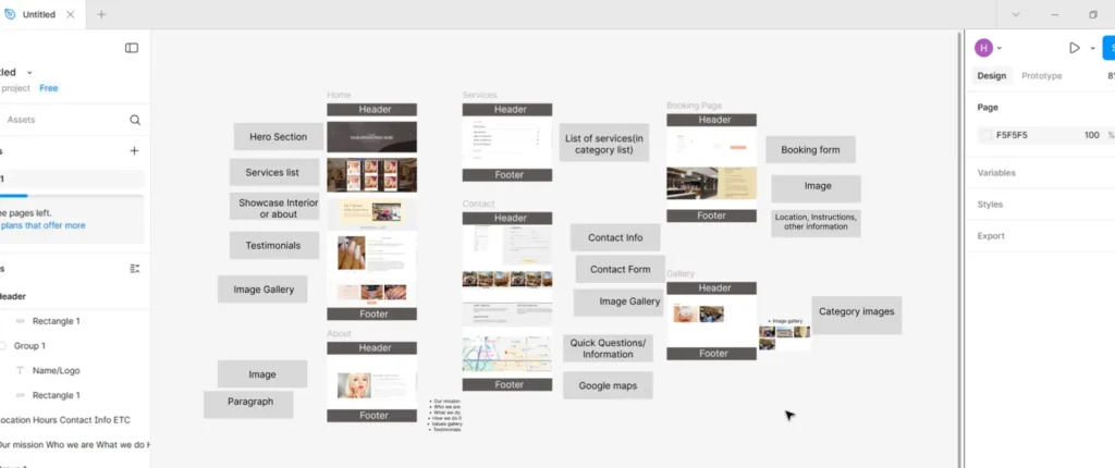
What comes next are the miscellaneous elements (like the header, footer, and booking form).
For these, do the same thing:
- Look at examples from your list of sites.
- Screenshot the parts you like (like the logo placement, menu style, or search bar).
- Drag them into Figma and place them together.
If one site doesn’t have everything you need, you can mix and match (use the logo from one site, the menu from another, and the color or layout from a third).
Repeat this for the footer and other elements (Ex: a booking form), and you’re done!
What You Have Now
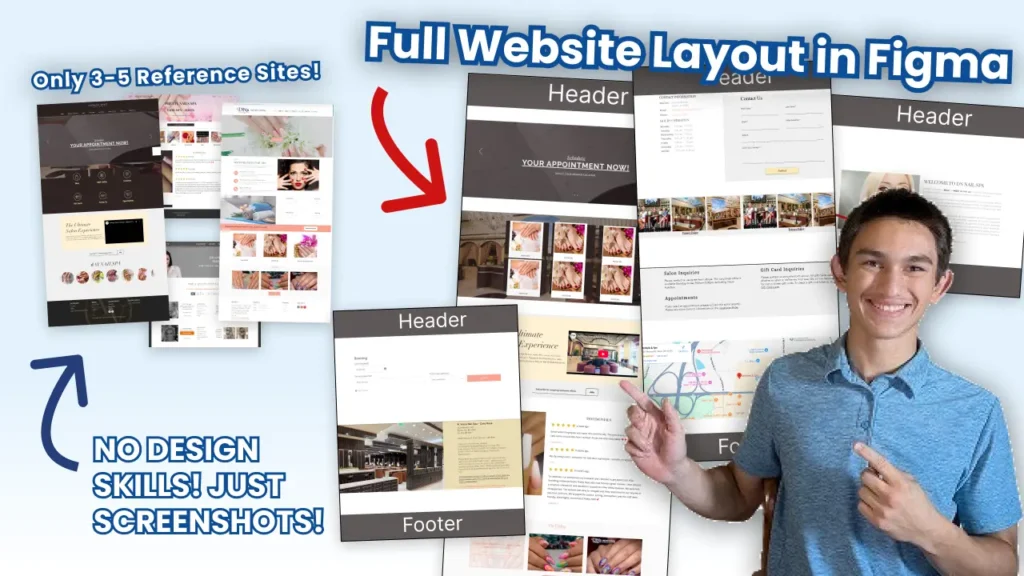
You now have a complete, detailed website layout that includes:
✅ Every page and section from your plan
✅ Real examples and screenshots for each part
✅ A header, footer, and booking form layout
✅ A visual reference that will speed up the final designing process
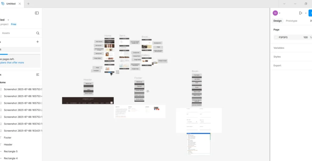
This layout becomes your blueprint or the bridge between planning and designing.
The next step? Turning this layout into a real design that can easily become a beautiful website. That’s what I’ll cover in the next video.
Need Some Help?
If building websites still confuses you, don’t worry. I’ve helped tons of businesses with their websites, and I’d love to personally help you, too!